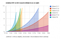
I was doing some thinking about lenses and depth of field and I came up with this comparison chart for a few MFT lenses. What I really wanted to find out was, what are the limitations of shallow depth of field based on aperture, focal length, and most importantly distance from the camera. As well as how can I squeeze my lenses for as much shallow DOF as they can deliver. As I suspected the depth of field become less shallow as you move away from the camera. This is all theoretical, but I found the chart to be really interesting to compare lenses to see where the dramatic DOF fun starts and ends. Id be curious if this actually holds up in the real world.
The vertical axis shows a distance between the near and far ranges of acceptable focus, aka, how shallow or deep your depth of field is. The horizontal axis shows distance from the camera, up to 10 meters.
The math is based on this great depth of field calculator.
www.dofmaster.com.
Heres a URL for the spreadsheet if you want to do some of your own calculations, make sure to check the proper “circle of confusion” for your camera from the above link.
https://docs.google.com/spreadsheet/ccc?key=0Al8khdl5MtbndEtqYkVlS2tmOGpOX0kxRUdubm92T3c
Incase the interactive graph doesnt work for you, heres a jpg.


